Run, Humans Relaunch
The initial motivation behind this blog was to provide friends and family with my whereabouts and photos during a trip around the world. At that time I had no idea where my blog was headed or how long it would last but I took pleasure in putting my thoughts into words and experiment with design and usability.
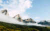
Little by little my focus shifted from a wider range of topics towards travel and photography and I soon realized that my blog didn’t meet my growing expectations.
If you want to learn more about me and the motivation behind this blog you can read about it here.
Design Refinement
The last version of Run, Humans was clean and simple with lots of white spaces that put content first and stayed out of the user’s way. While I liked the unobstrusive design of the last iteration I think it lacked a clear visual identity. With the new Run, Humans I wanted to remain faithful to the clean, minimal aesthetic of the last version while creating more elements to underline the blog’s purpose.
A logo is the most significant feature of a brand and so far I didn’t even have one except for the name written in text. The new logo reflects my focus on travel with a simplified outdoor-scenery that is inspired by little scribbles I often use on postcards to give them a personal touch.
In order to give the logo more purpose than simply being the envisioned brand identity, the upper left part has a dual function as an icon or simplified logo version for social channels. The square under the name is a blank space in its neutral state and shows category icons whenever an article is opened. Furthermore the logo is responsive and has two states to alternate between different screen sizes and the two states of the sidebar on the left.
I wanted to let content take the center stage of my blog that focuses on articles and photography and thus make sure to use a minimalistic design with lots of whitespace and simple typefaces. The typography is inspired by the simplicity and readability of Medium and Good.is. To create a feeling of reading a magazine I put the strongest emphasis on articles that can be read distraction-free when the sidebar on the left is minimized. The sidebar shows the latest articles to invite users to dive deeper and quickly jump to a different article.
To achieve a feeling of exploration and craftmanship I tried to care for even tiny details like transitions or animations and left some room for discoveries like the icons for the different blog-topics.
Next Steps
I already have a few ideas for future updates up my sleeve but I didn’t want to cramp everything into the relaunch. For now I will concentrate on publishing my latest travel reports in regular intervals and roll out visual and functional updates from time to time.
Thanks for reading my blog. If you have a question or comment I’m happy to get a message from you or hear your feedback in the comments below.